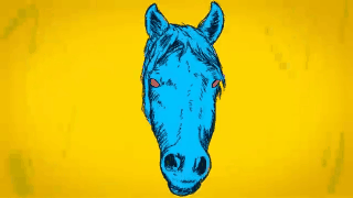
March 2019
Art By Matthew Bremer
Call For Artists
All medium art challenges every week. Scroll down and enter today :)
March 6th
Turning Science into Art:
Conrad Shawcross
From elaborate machines that do not seem like artworks at first sight, to geometric structures, the works of Conrad Shawcross are ways of the artist studying philosophy and science. To the extent that he picks his high school math teacher and a friend of his who is a computer engineer as the mentors of his life, he shows enormous passion for science studies.Saying that he is attracted to scientific theories that had failed logically or methodologically, Shawcross reinterprets such theories in his own ways to create ambitious and structural sculptures.

Featured Artist
Matthew Bremer
Let me take you on a trip. Let us travel past the frame and through the color, line, and shadow. Approach the images and look deeper to the world that lies beyond the confines of the surface. Feel the weight and texture of the color. Reach out and touch the movement that surrounds each line. Explore the story beyond the shadow. The prospect of inspiring this adventure is what fuels my desire to create.I find great joy in the journey my work can take you on.
I strive to evoke humor, whimsy, and a tranquility through the deconstruction and re purposing of themes and objects that have been negatively charged and discarded by society. Much in the same way that I physically re purpose the glass and windows I often create upon. Transforming them from trash into portals of exploration. Inspiration and mind expansion come to those who use my creations to fuel imagination and propel the viewer to new creative heights.
I consider myself an Illustrator but I also do a lot of graphic design. When I am not working in the digital realm I prefer to used pastels and oil based paints on salvaged windows and picture frames to create fluid modern pop art. I have been creating since I can remember. I loved drawing and sculpting with clay when I was a child, did some painting and 2D animation in my early 20's while establishing my point of view and coming to grips with my insecurities and strengths. I have always been inspired by the classic style of cell cartoon animation and the windows I started collecting from alleys gave me a way to experiment and create in a style I had such a passion for. Some folks find it strange, offense, and childish (which I will gladly take as a compliment) but I am truly happy when someone gets the irony, whimsy, and power over fear that my work is all about.
Music and literature inspire me most. Specifically H.P. Lovecraft and late 60's psychedelic rock. I'll be listening or reading and the seeds of an idea will just appear. I let my images grow organically and never tie myself to an original sketch or idea. I think having an open mind while creating makes the end result that much more of a journey that will hopefully translate to the viewer.


Creative gifts by Matthew Bremer! shop today :)

Creative gifts by Matthew Bremer! shop today :)

Creative gifts by Matthew Bremer! shop today :)
Creative gifts by Matthew Bremer! shop today :)


Josh E Wylie


Sponsored by Gamblin
Navigating Color Space
This video shows painters how to access the universe of color or "Color Space". The animated sequences demonstrate how to define a color by its attributes: value, hue and intensity (chroma). During the program, Robert Gamblin demonstrates a few of the secrets of the Old Masters so you, too, will know how to mix green and red into blue. This is the same as the previously posted 3-part video but higher quality and in its entirety.

Featured Videos
KQED Art School
Brush up on your knowledge of color in the sixth installment of our Elements of Art series. By considering the vital and vibrant work of the Color Field painters of the 1950s and 60s, we get a glimpse of how powerful a role color plays in art.

Studioofmm
Specific Products Used Strathmore Softcover Watercolor Journal, 8 by 5.5-Inch Prismacolor Premier Soft Core Coloured Pencils FW Acrylic Artists Ink in White Random Toothbrush
Use STUDIOOFMM10 for 10% off of anything!
: http://www.studioofmm.com

Who is this artist?
How Color, Type and Space Can Impact Mood
Sponsored by Design Shack
Do you ever think about mood when you are designing?
Mood has impact in two ways – the mood of the project itself and the mood of users. Together they create an experience that connects each user to the project.
While you can’t always account for the mood of users, or their good and bad days, you can create an aesthetic that emphasizes the right mood for your project. Three basic design techniques – color, typography and space – are key components for establishing the mood of a project.
Moods are an extension of emotions. This less defined sort of feeling often falls into the category of good or bad and last for longer periods of time than a specific emotion. Moods can change based on events, environmental factors or even by viewing something, but mood is primarily a feeling that just happens and is less intense than a specific emotion. It can impact how a person thinks about everything he or she comes in contact with.
What makes mood especially interesting and important for designers is that researchhas shown mood influences advertising and brand attitudes. One common finding is that almost everyone surveyed, regardless of gender or expressed mood, preferred to view information that’s presented in a happy way.
When you think about mood, two extremes come to mind – good and bad (or positive and negative). These moods often emerge from emotional influences such as anger, fear, disgust, happiness, sadness and surprise. Mood can also happen for a group or crowd, resulting in a common mood that creates a shared emotional experience.
So how does all of this impact design? Mood establishes how users will connect to a project. Will they view it in a positive or negative way? How will they process they information presented? Does the mood of the project establish a connection with the mood of users in a way that creates a commonality or group feeling?
Color associations in terms of mood require a lot of context. How the color is used – a dominant color versus accent – and other colors in proximity to it can have great impact.
Design techniques such as tint, tone, saturation and contrast make a lot of difference as well. The warmness or coolness of colors are also directly associated with mood.
-
Warm colors are soothing and creative but can feel chaotic or stressful (red, yellow, orange)
-
Cool colors are inviting and professional but can feel unfriendly or stark (blue, green, purple)
Positive color associations
-
Red: Love, urgency, youth
-
Orange: Energy, ambition, enthusiasm
-
Yellow: Cheer, joy, energy
-
Green: Growth, nature, luck
-
Blue: Peace, trust, security
-
Purple: Wisdom, respect, wealth
Negative color associations
-
Red: Warning, war, annoyance
-
Orange: Anxiety, aggressiveness, nervousness
-
Yellow: Insecurity, distraction, panic
-
Green: Envy, apprehension, uncertain
-
Blue: Grief, remorse, dispassion
-
Purple: Boredom, loathing, disgust
Adding black any color give it a more negative association, while adding white creates a more positive feel. This applies both to the actual color mix of each hue and surrounding colors and contrast.

Jack Kirby

Callie Fink

Just to help you out!
Resources & Materials
Find more links to jobs and what not in the February 201 publication